

WATERCOLORING
IN
HOMEBREWERY


A RESOURCE FOR CREATING BEAUTIFUL HOMEBREWS
Contents
Image Manipulation
2
Choosing an Image .........................................................................
2
Adding an Image ..............................................................................
2
Image Filter ......................................................................................
2
Filter Examples................................................................................
3
Image Transform .............................................................................
4
Transform Examples.......................................................................
4
Blending
5
Understanding Layers.....................................................................
5
Roughing the Edge ..........................................................................
5
Preface
Creating a game supplement can be a fun and challenging undertaking. The usability and general acceptance of the content is often derived from the written word. Balance, lore, and imaginative combinations or dynamics can create a high quality addition to the game. If you want to bring your content to the next level, however, imagery can entertain both the eye and the imagination.
This guide serves to instruct you on the matters of adding graphics to your supplement and manipulating them to reflect the style of official products. In the following pages, you will be shown how to add a graphic, manipulate it's location and look, then add additional elements to blend it into the background.
The tool utilized by this guide is The Homebrewery, a simple and fantastic online editor for gaming enthusiasts. Some basic familiarity with the tool is assumed, but attempts will be made to make the processes described herein as plain as possible. Should questions arise, feel free to contact the author.
Credits
Lead Designer/Producer: QalarValar
Cover Illustrator: Sandara
Interior Illustrators: Outland Arts (pg. 1), Zack Stella (pg. 2-5)
Resources: Brush sets derived freely through the courtesy of Denny Tang and Daniel Kamarudin. Homebrew icon and label by AeronDrake. Footer graphic derived, with permission, from Oakendragon. Other art and visual assets (including illustrations credited above) were used in good faith to create this document without express permission from their owners unless otherwise stated
Context: Dungeons and Dragons 5th Edition by Wizards of the Coast, LLC
The Homebrewery: An amazing tool by Scott Tolksdorf
Image Manipulation
Before we can begin to blend images to reflect our desired style, we need to know how to properly add an image and change its appearance. In this section, we will cover image selection, positioning, and how to apply visual effects and transformations.
Choosing an Image
When choosing an image to add, you'll want to consider three things: size, skill, and subject.
| What | Why | |
|---|---|---|
| Size | Usually, the more pixels, the merrier. | |
| Skill | Well rendered subjects tend to be better than poorly rendered ones, artistically speaking. | |
| Subject | It should relate closely to the topic or vision of your supplement. |
The size of the image isn't equally as important as the pixel density, and the two often go hand in hand. The image should be large enough, or dense enough, that when stretched or shrunk to fit, it doesn't appear degraded. A degraded image might create negative assumptions about your other content. Reverse image searching tools, like Google Images, can make finding variations in size quite easy, and are also helpful in finding other information about an image. Your results may vary depending upon the obscurity of the image.
The skill of the artist should be taken into account, since graphics are where the eye often lands in a document. The quality of art can create an immediate impression of overall quality or designer experience. There are many varieties of artistic skill and preference, so find (or perhaps even create) something that you feel comfortable with and that you feel reflects your supplement in the best way.
The subject of the illustration should be relevant to your work, directly or in theme, in order to enhance the imagination and association of the visual to your text. Irrelevant imagery may only serve as a distraction, or lead your reader to confusion. On the other hand, illustrations depicting a specific aspect of your supplement can stir the imagination where text might fall short.
As a final comment on choosing images, be sure to keep cohesion in mind. Having a unified artistic style can really tie together a document. Finding quality artists, with similar styles and skill levels can be a challenge, but the effort can pay off.
freely available, not free
Keep in mind that online art can be easily found and collected, but it's use is typically under some form of copyright. Wrongfully distributing or selling art directly affects artists' livelihoods. Typically, when you aren't getting a profit, crediting the artist and where you found it is a good practice. If you are seeking a profit, use art you have purchased outright, negotiated distribution rights for, or have created yourself.
Adding an Image
Once you have an image chosen, you'll want to add a placeholder to your document through the menu to the upper left of the Homebrewery editor (Editor > Background Image). By using a background image, you are afforded more control over positioning independent of any text you may include in your document.
A default image will be provided for you when you add this item, so you will want to replace the default URL with the URL of your selected image. Your image should be publicly accessible on the web to function - this is typically the case with illustrations found through browsing, but some hosts, or hosting methods, can cause issues. This usually becomes evident when the image does not appear and can be due to an access issue or an invalid URL.
For the purposes of this guide, we'll use the following graphic of a warrior.
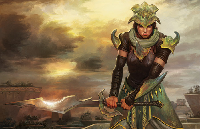
Image Filter
The inserted code block for your image provides you with some powerful control over it. One way to modify the appearance of the image is by using a filter. A filter allows you to change the colors, intensities, and transparencies of the image. This property won't be used often with your base image, but can be important to achieving the watercolor blending effect described later in this guide.
For your base images, using a filter can help you set a tone across multiple images by coordinating a color scheme, luminosity, or other quality in addition to the image subjects. Here is a list of useful properties you can adjust using the filter:
Filter Properties
| Property(unit) | Effect |
|---|---|
| brightness(%) | lightens or darkens the image |
| contrast(%) | adjusts the difference between colors |
| grayscale(%) | transitions the image to "black and white" |
| hue-rotate(deg) | slides the palette about the color wheel |
| opacity(%) | reveals the background behind the image |
| saturate(%) | adjusts the intensity of the colors |
| sepia(%) | transitions the image colors to sepia |
IMAGE MANIPULATION
Filter Examples
The following are examples showing the original image (left) with the property-adjusted image on the right. There is also a code snippet immediately below each example that shows the style string format to use the property. Each filter property can be used together, with varying results. Here is a combined filter snippet that makes no changes to the base image, but can be adjusted to suit your needs.
style='position:absolute; top:80px; left:240px; width:150px; filter:brightness(100%)contrast(100%) grayscale(0%)hue-rotate(0deg) opacity(100%)saturate(100%)sepia(0%);'
Brightness
style='position:absolute; top:80px; left:240px; width:150px; filter:brightness(150%);'
Contrast
style='position:absolute; top:80px; left:240px; width:150px; filter:contrast(150%);'
Grayscale
style='position:absolute; margin-top:10px; left:240px; width:150px; filter:grayscale(70%);'
Hue-Rotate
style='position:absolute; top:80px; left:240px; width:150px;
filter:hue-rotate(100deg);'
Opacity
style='position:absolute; top:80px; left:240px; width:150px; filter:opacity(50%);'
Saturate
style='position:absolute; top:80px; left:240px; width:150px; filter:saturate(150%);'
Sepia
style='position:absolute; top:80px; left:240px; width:150px;
filter:sepia(70%);'
IMAGE MANIPULATION
Image Transform
The display of an inserted image can be altered through use of a transformation. A transformation doesn't change the contents of the image, unlike a filter, but changes the positioning and point of view. This property will be used often to get your base image just right as well as to blend it into the background (a process described later in this guide).
Here is a list of useful properties you can adjust using a transform:
Transform Properties
| Property(unit) | Effect |
|---|---|
| rotate(deg) | turns about, clockwise with positive value |
| scaleX(1.0) | alter size horizontally, use negative to flip |
| scaleY(1.0) | alter size vertically, use negative to flip |
Transform Examples
The following are examples showing the original image (left) with the property-adjusted image on the right. There is also a code snippet immediately below each example that shows the style string format to use the property. Each transform property can be used together, with varying results. Here is a combined transform snippet that makes no changes to the base image, but can be adjusted to suit your needs.
style='position:absolute; top:80px; left:240px; width:150px; transform:rotate(0deg)scaleX(1)scaleY(1);'
Rotate
style='position:absolute; top:80px; left:240px; width:150px;
transform:rotate(180deg);'
ScaleX
style='position:absolute; top:80px; left:240px; width:150px;
transform:scaleX(-1);'
Complete Transformation
There are many more ways to utilize the transform property of an image's style, but the ones presented here have been the most useful to the author. If you'd like to explore further transformation properties, w3schools has many resources.
For example, scaleX is the property suggested here to flip an image horizontally. There is another property, rotateY that can also generate this effect, but it seems rotateY can have some trouble rendering on mobile devices, so scaleX is preferred.
As a final tip for advanced users, there is a property skewX that allows you to create a slant with an image. This can be very handy for created shadows of singular figures, but it should be noted that while the Homebrewery will render these beautifully, the image has trouble rendering during the print process.
ScaleY
style='position:absolute; top:80px; left:240px; width:150px;
transform:scaleY(-1);'
IMAGE MANIPULATION
Blending
Now that we know how to add our base images to our document and manipulate them, we will learn how to blend them into the background using watercolor images found here and in high definition here. By blending parts of the image into the background, we can creat an official look as well as isolate the parts of the image we want to highlight.
Understanding Layers
In the homebrewery, layering images is pretty simple; from top to bottom of the markdown code you establish bottom to top layering. This means the image that is first rendered goes on the bottom and is underneath by any following images. Remember, we use absolute positioning, which are "background" images, and you may experience different behavior when interacting with relative or "foreground" images.
Roughing the Edge
To start blending your base image, find a watercolor stain that suits you in the linked gallery. Add the image as described in the previous section, but be sure to add it after your base image in the markdown layout. Filter and transform the watercolor stain to suit your tastes, including experimenting with color. With the upper right image on this page, I have shown a small example of this with our base and two stains.
This process can take some time if you want the look "just right". Position, scale, rotation, and even the opacity of the stains can affect an interesting and unique look. You should take the time to find a stain that creates a pleasing contour around the image of your subject, and be unafraid to use many different stains in different orientations. As long as you are happy in the end, you've reached your goal.
Smoothing the Edge
Once you've established the stained edge, you have a couple options, but at this point you should not be changing the colors from what matches the background. First, you can continue to layer stains to create a rough blending effect, or second, you can use the circle blending images (not stains) to quickly fade the base into the background. Whichever your preference, add the appropriate images and position them to your liking. With the lower image on the right, I've used two circle blending images to create a soft transition between the watercoloring and the background.
Further Examples
Using this technique, I have created the following homebrew content. You can see how the technique will result in practice, as well as view the source to see the markdown used to create them.
- This example includes a created shadow.
- This example includes some extra rough edges.
- This example highlights a smoothed blending.
- Here is another homebrewery guide you may find useful.


IMAGE MANIPULATION